
matplotlib#
Matplotlib is the core plotting package in scientific python. There are others to explore as well (which we’ll chat about on slack).
Tip
There are different interfaces for interacting with matplotlib, an interactive, function-driven (state machine) command-set and an object-oriented version. We’ll focus on the OO interface.
import numpy as np
import matplotlib.pyplot as plt
Matplotlib concepts#
Matplotlib was designed with the following goals (from mpl docs):
Plots should look great – publication quality (e.g. antialiased)
Postscript output for inclusion with TeX documents
Embeddable in a graphical user interface for application development
Code should be easy to understand it and extend
Making plots should be easy
Matplotlib is mostly for 2-d data, but there are some basic 3-d (surface) interfaces.
Volumetric data requires a different approach
Gallery#
Matplotlib has a great gallery on their webpage – find something there close to what you are trying to do and use it as a starting point:
Importing#
There are several different interfaces for matplotlib (see https://matplotlib.org/3.1.1/faq/index.html)
Basic ideas:
matplotlibis the entire packagematplotlib.pyplotis a module within matplotlib that provides easy access to the core plotting routinespylabcombines pyplot and numpy into a single namespace to give a MatLab like interface. You should avoid this—it might be removed in the future.
There are a number of modules that extend its behavior, e.g. basemap for plotting on a sphere, mplot3d for 3-d surfaces
Anatomy of a figure#
Figures are the highest level object and can include multiple axes
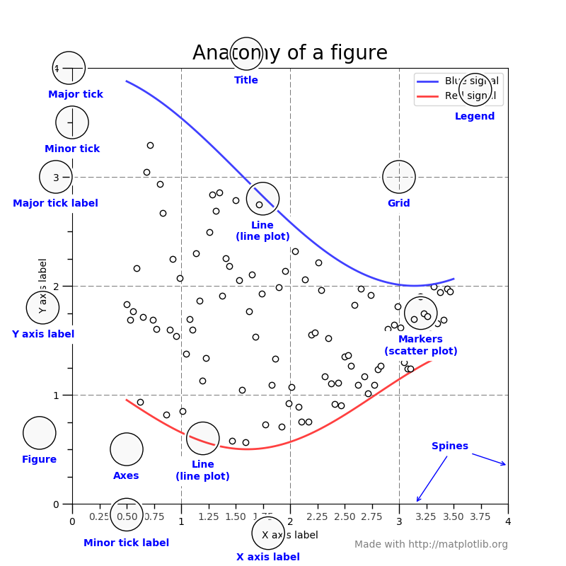
(figure from: https://matplotlib.org/stable/gallery/showcase/anatomy.html )
Backends#
Interactive backends: pygtk, wxpython, tkinter, …
Hardcopy backends: PNG, PDF, PS, SVG, …
Basic plotting#
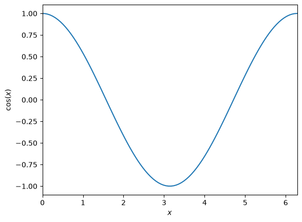
plot() is the most basic command. Here we also see that we can use LaTeX notation for the axes
x = np.linspace(0.0, 2.0*np.pi, 100)
y = np.cos(x)
fig = plt.figure()
ax = fig.add_subplot(111)

ax.plot(x, y)
ax.set_xlabel(r"$x$")
ax.set_ylabel(r"$\cos(x)$")
ax.set_xlim(0, 2*np.pi)
(0.0, 6.283185307179586)
Exercise
We can plot 2 lines on a plot simply by calling plot twice. Make a plot with both sin(x) and cos(x) drawn
we can use symbols instead of lines pretty easily too—and label them
fig = plt.figure()
ax = fig.add_subplot(111)
ax.plot(x, np.sin(x), "o", label="sine")
ax.plot(x, np.cos(x), "x", label="cosine")
ax.set_xlim(0.0, 2.0*np.pi)
ax.legend()
<matplotlib.legend.Legend at 0x7f1b43715160>
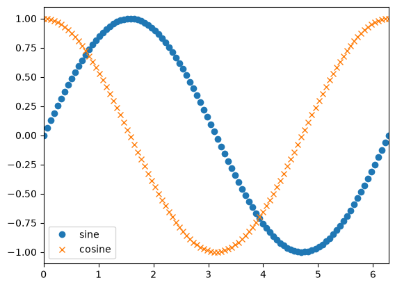
Here we specified the format using a “format string” (see https://matplotlib.org/3.1.1/api/_as_gen/matplotlib.pyplot.plot.html)
This has the form '[marker][line][color]'
most functions take a number of optional named arguments too
ax.clear()
ax.plot(x, np.sin(x), linestyle="--", linewidth=3.0)
ax.plot(x, np.cos(x), linestyle="-")
fig
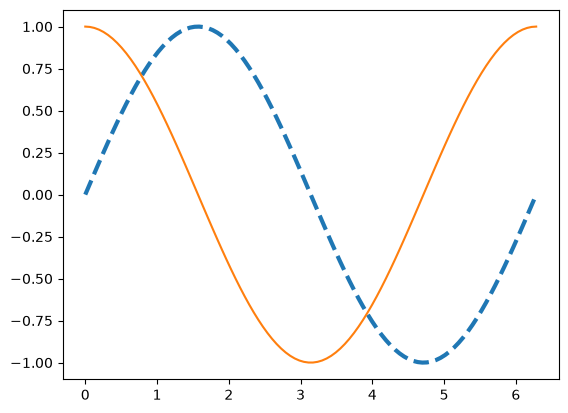
there is a command setp() that can also set the properties. We can get the list of settable properties as
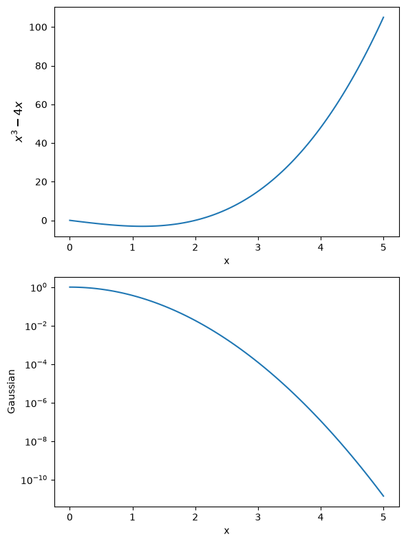
Multiple axes#
There are a wide range of methods for putting multiple axes on a grid. We’ll look at the simplest method.
The add_subplot() method we’ve been using can take 3 numbers: the number of rows, number of columns, and current index
fig = plt.figure()

ax1 = fig.add_subplot(211)

x = np.linspace(0,5,100)
ax1.plot(x, x**3 - 4*x)
ax1.set_xlabel("x")
ax1.set_ylabel(r"$x^3 - 4x$", fontsize="large")

ax2 = fig.add_subplot(212)

ax2.plot(x, np.exp(-x**2))
ax2.set_xlabel("x")
ax2.set_ylabel("Gaussian")

# log scale
ax2.set_yscale("log")

# set the figure size
fig.set_size_inches(6, 8)

# tight_layout() makes sure things don't overlap
fig.tight_layout()
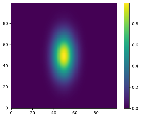
Visualizing 2-d array data#
2-d datasets consist of (x, y) pairs and a value associated with that point. Here we create a 2-d Gaussian, using the meshgrid() function to define a rectangular set of points.
def g(x, y):
    return np.exp(-((x-0.5)**2)/0.1**2 - ((y-0.5)**2)/0.2**2)

N = 100

x = np.linspace(0.0,1.0,N)
y = x.copy()

xv, yv = np.meshgrid(x, y)
A “heatmap” style plot assigns colors to the data values. A lot of work has gone into the latest matplotlib to define a colormap that works good for colorblindness and black-white printing.
fig = plt.figure()
ax = fig.add_subplot(111)
im = ax.imshow(g(xv, yv), origin="lower")
fig.colorbar(im, ax=ax)
<matplotlib.colorbar.Colorbar at 0x7f1b43606660>
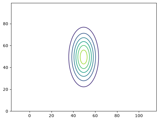
Sometimes we want to show just contour lines—like on a topographic map. The contour() function does this for us.
fig = plt.figure()
ax = fig.add_subplot(111)
contours = ax.contour(g(xv, yv))
ax.axis("equal")   # this adjusts the size of image to make x and y lengths equal
(np.float64(0.0), np.float64(99.0), np.float64(0.0), np.float64(99.0))
Exercise
Contour plots can label the contours, using the ax.clabel() function.
Try adding labels to this contour plot.