matplotlib#
matplotlib is the core visualization package in python. We import it as:
import matplotlib.pyplot as plt
This puts all of the main plotting functions / classes into the plt namespace.
Anatomy of a figure#
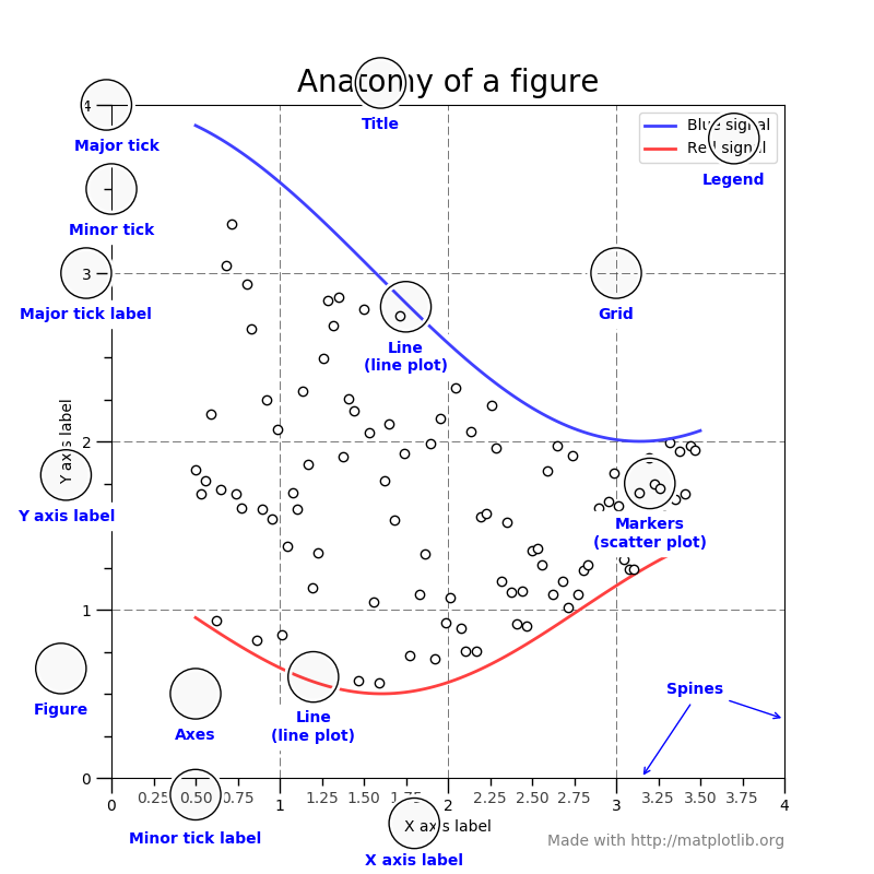
Fig. 13 The main elements of a matplotlib figure (figure from http://matplotlib.org/faq/usage_faq.html#parts-of-a-figure)#
Basic plotting#
Let’s start with a simple example of plotting \(\sin(x)\). We’ll first create
an array of \(x\) values using np.linspace, and then make the plot:
import matplotlib.pyplot as plt
import numpy as np

x = np.linspace(0, 2.0 * np.pi, 100)

fig, ax = plt.subplots()
ax.plot(x, np.sin(x))
ax.set_xlabel("x")
ax.set_ylabel("sin(x)")
fig.savefig("basic.png")
here’s the figure it produces:
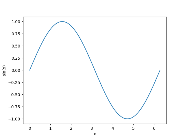
Fig. 14 A plot of sin(x)#
Here’s how we make the plot:
We use the matplotlib subplots function to create a
FigureandAxesobject.We use plot to make the plot, simply giving the \(x\) and \(y\) arrays of data to plot.
We set the \(x\) and \(y\) labels using set_xlabel and
set_ylabelon theAxesobject.We use savefig on the
Figureto save a PNG file.
Tip
There is a lot of additional styling that can be done. A good place to see what is possible is the examples gallery.
Visualizing 2-d arrays#
import numpy as np
import matplotlib.pyplot as plt

def g(x, y):
    return np.exp(-((x - 0.5)**2) / 0.1**2 - ((y - 0.5)**2) / 0.2**2)

N = 100
xmin = 0.0
xmax = 1.0
x = np.linspace(xmin, xmax, N)
y = x.copy()

xv, yv = np.meshgrid(x, y)

fig, ax = plt.subplots()

im = ax.imshow(g(xv, yv), origin="lower", extent=[xmin, xmax, xmin, xmax])
fig.colorbar(im, ax=ax)

fig.savefig("heatmap.png")
Here we use np.meshgrid which takes two 1D arrays and makes two 2D arrays with the elements repeated in the appropriate dimension. For example:
>>> x = np.linspace(0, 1, 5)
>>> y = np.linspace(0, 1.5, 6)
>>> x2d, y2d = np.meshgrid(x, y)
>>> x2d
array([[0.  , 0.25, 0.5 , 0.75, 1.  ],
       [0.  , 0.25, 0.5 , 0.75, 1.  ],
       [0.  , 0.25, 0.5 , 0.75, 1.  ],
       [0.  , 0.25, 0.5 , 0.75, 1.  ],
       [0.  , 0.25, 0.5 , 0.75, 1.  ],
       [0.  , 0.25, 0.5 , 0.75, 1.  ]])
>>> y2d
array([[0. , 0. , 0. , 0. , 0. ],
       [0.3, 0.3, 0.3, 0.3, 0.3],
       [0.6, 0.6, 0.6, 0.6, 0.6],
       [0.9, 0.9, 0.9, 0.9, 0.9],
       [1.2, 1.2, 1.2, 1.2, 1.2],
       [1.5, 1.5, 1.5, 1.5, 1.5]])
This allows us to call a function, g(x, y), and get its value
at all points.
Here’s the figure it produces:
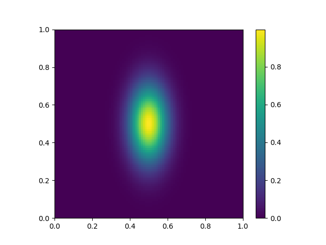
Fig. 15 A “heatmap” style plot of an array.#
Other plot types#
The matplotlib example gallery has lots of examples of output together with the code used to produce the figure. This is the best way to learn.