Visualizing MESA reactions#
import pynucastro as pyna
import mesa_reader as mr
from pynucastro import mesa_utils
from pynucastro.screening import chugunov_2007
Read in the MESA model#
model = mr.MesaData("lab3/profile2.data")
nuclei = mesa_utils.get_nuclei(model)
mesa_zones = mesa_utils.get_all_data(model)
Create the network using the same species as the MESA model#
By default, network_helper will find all the rates connecting the nuclei, some of which were likely not used in the MESA simulation.
net = pyna.network_helper(nuclei)
net.summary()
Network summary
---------------
  explicitly carried nuclei: 15
  approximated-out nuclei: 0
  inert nuclei (included in carried): 0

  NSE compatible? False

  total number of rates: 38

  rates explicitly connecting nuclei: 38
  hidden rates: 0

  reaclib rates: 12
  starlib rates: 0
  temperature tabular rates: 0
  weak tabular rates: 14
  approximate rates: 0
  derived rates: 12
  modified rates: 0
  custom rates: 0
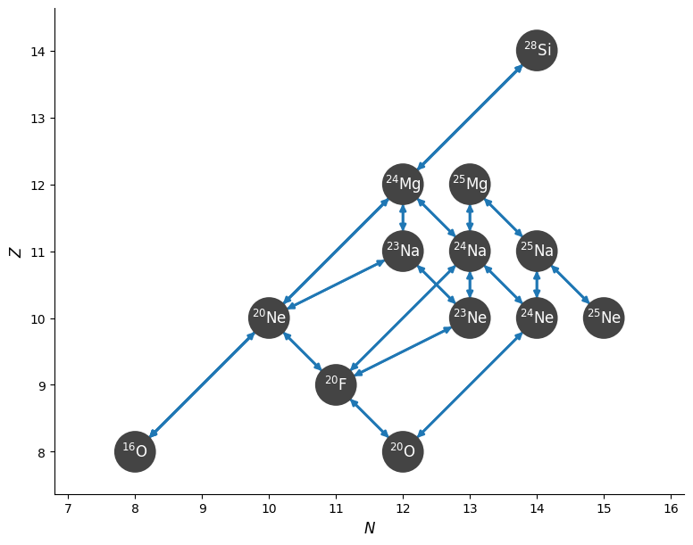
We can see the structure of the network
fig = net.plot()
The Suzuki rates are not valid for \(\rho Y_e < 10^7~\mathrm{g~cm^{-3}}\), so let’s find the model index that corresponds to
i_cutoff = min(i for i in range(len(mesa_zones)) if mesa_zones[i][0] * mesa_zones[i][-1].ye > 1.e7)
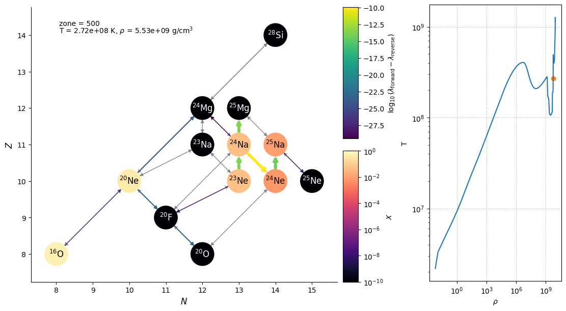
A network plot#
Here’s a function that takes a zone index from the MESA model and makes a plot showing both the flow through the network at that zone and the entire MESA model in the log \(\rho\)-log T plane, with a point indicated the zone we are visualizing.
import matplotlib.pyplot as plt
rhos = [v[0] for _, v in mesa_zones.items()]
Ts = [v[1] for _, v in mesa_zones.items()]
def _make_plot(i_zone, curved_edges=False, legend=False):
    fig = plt.figure()
    fig.set_layout_engine("constrained")
    gs = fig.add_gridspec(nrows=1, ncols=2, width_ratios=[3, 1])
    gs_net = gs[0].subgridspec(2, 2, width_ratios=[20, 1])
    ax_rhoT = fig.add_subplot(gs[1])
    if curved_edges:
        use_net_rate = False
    else:
        use_net_rate = True
    if legend:
        legend_coord = (11.5, 8.5)
    else:
        legend_coord = None
    rho, T, comp = mesa_zones[i_zone]
    net.plot(rho=rho, T=T, comp=comp,
             screen_func=chugunov_2007,
             use_net_rate=use_net_rate, curved_edges=curved_edges,
             ydot_cutoff_value=1.e-30,
             legend_coord=legend_coord,
             show_small_ydot=True,
             grid_spec=gs_net,
             color_nodes_by_abundance=True)

    ax_rhoT.loglog(rhos, Ts)
    ax_rhoT.set_xlabel(r"$\rho$")
    ax_rhoT.set_ylabel("T")
    ax_rhoT.scatter([rho], [T], marker="o", color="C1")
    ax_rhoT.grid(ls=":")

    fig.text(0.1, 0.9, rf"T = {T:6.3g} K, $\rho$ = {rho:6.3g} g/cm$^3$", transform=fig.transFigure)
    fig.text(0.1, 0.925, f"zone = {i_zone}", transform=fig.transFigure)
    fig.set_size_inches(11, 6)
_make_plot(500)
Interactive plot#
We can make the plot interactive by using ipywidgets
from ipywidgets import interact
interact(_make_plot, i_zone=(i_cutoff, len(mesa_zones)-1, 1), curved_edges=False)
<function __main__._make_plot(i_zone, curved_edges=False, legend=False)>